FORT Robotics
I led an extensive redesign of the FORT device management platform, increasing customer satisfaction by 30% for customers like John Deere, CAT, and Trimble. The new version enabled customers to create their device setup in half the time and cut internal Dev time by 40% when adding support for new devices.
2023
Product Design, Design Leadership
The Challenge
Within the first two weeks of being hired, I was asked to begin reviewing the platform for potential improvements. This was my first time working in the robotics, automation, and security space, so there was a lot to learn in a short amount of time. The development team had already started rewriting the codebase in React because the previous version was legacy tech with no documentation. The race was on to discover and solve any existing usability issues before the Dev team got too far ahead recreating old problems with new code.
About FORT
FORT Robotics, an IIoT startup, prioritizes human safety in interactions with robots and autonomous machines. Their hardware products, including wireless remote controls and emergency stop devices are set up and configured in the FORT Manager platform.
Discovering Problems
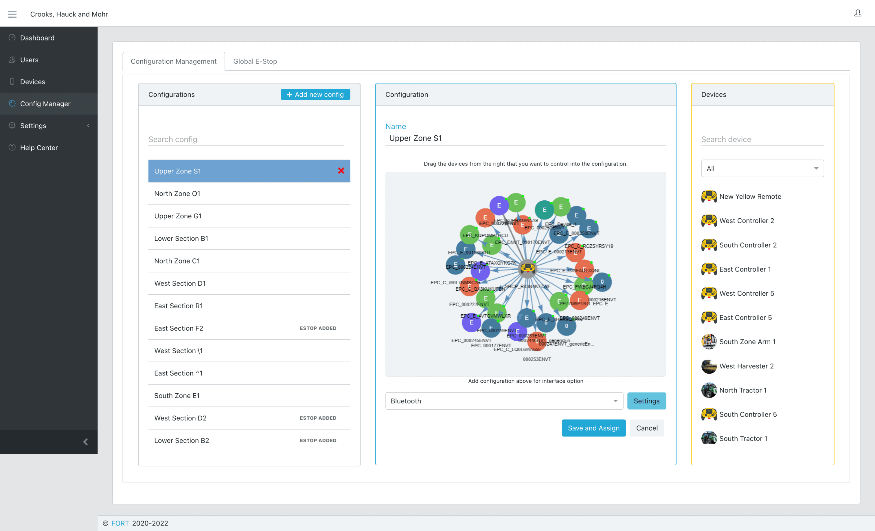
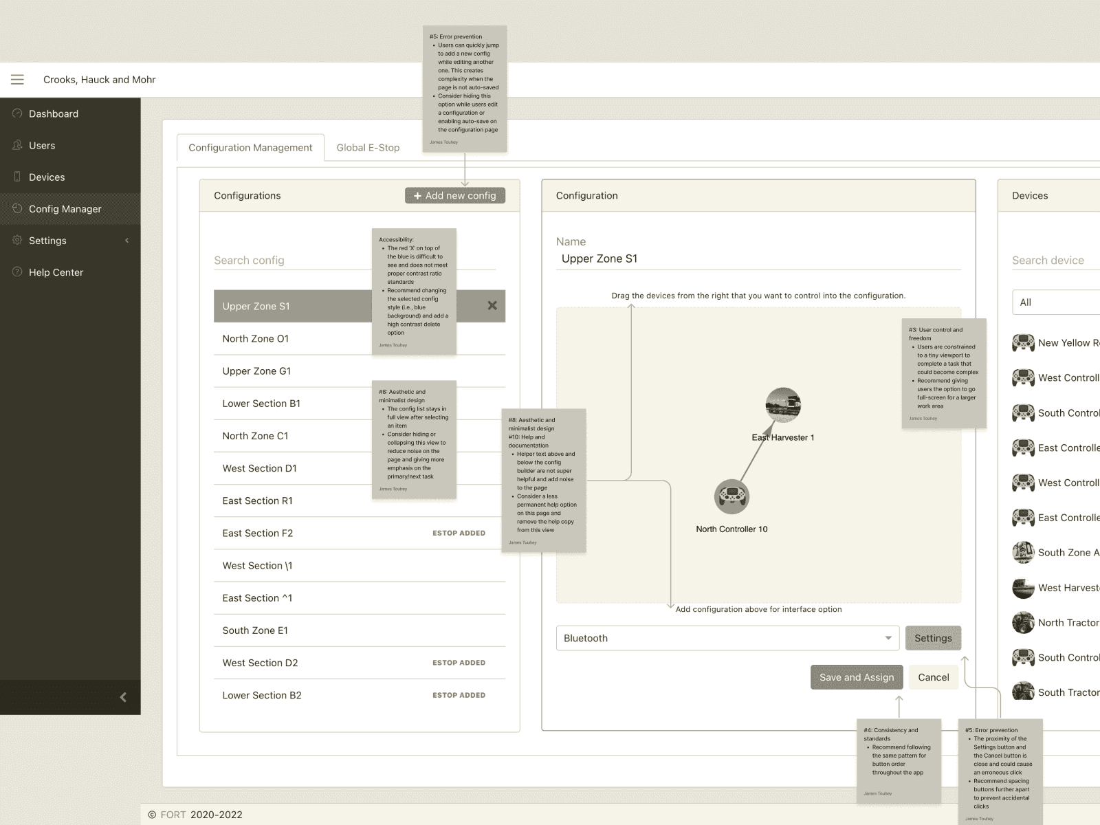
To uncover potential opportunities, I collaborated with the design team to conduct a comprehensive app heuristic. We lacked existing analytics, so we relied on internal stakeholder feedback, customer support tickets, and usability findings from the heuristic process.
Our analysis involved examining over 100 individual app views, incorporating nearly 130 sticky notes with feedback.
On the surface, the app faced a lot of easily solvable issues related to accessibility, UX copy, and UI (E.g., pattern inconsistencies and sizing/layouts.) In fact, we did a quick clean-up of these issues and shipped an iterative version on the existing platform with the goal of improving usability by 10% while we worked on some of the larger problems.
Primary issues
As we dug deeper, the harder problems emerged.
Node-based Configs
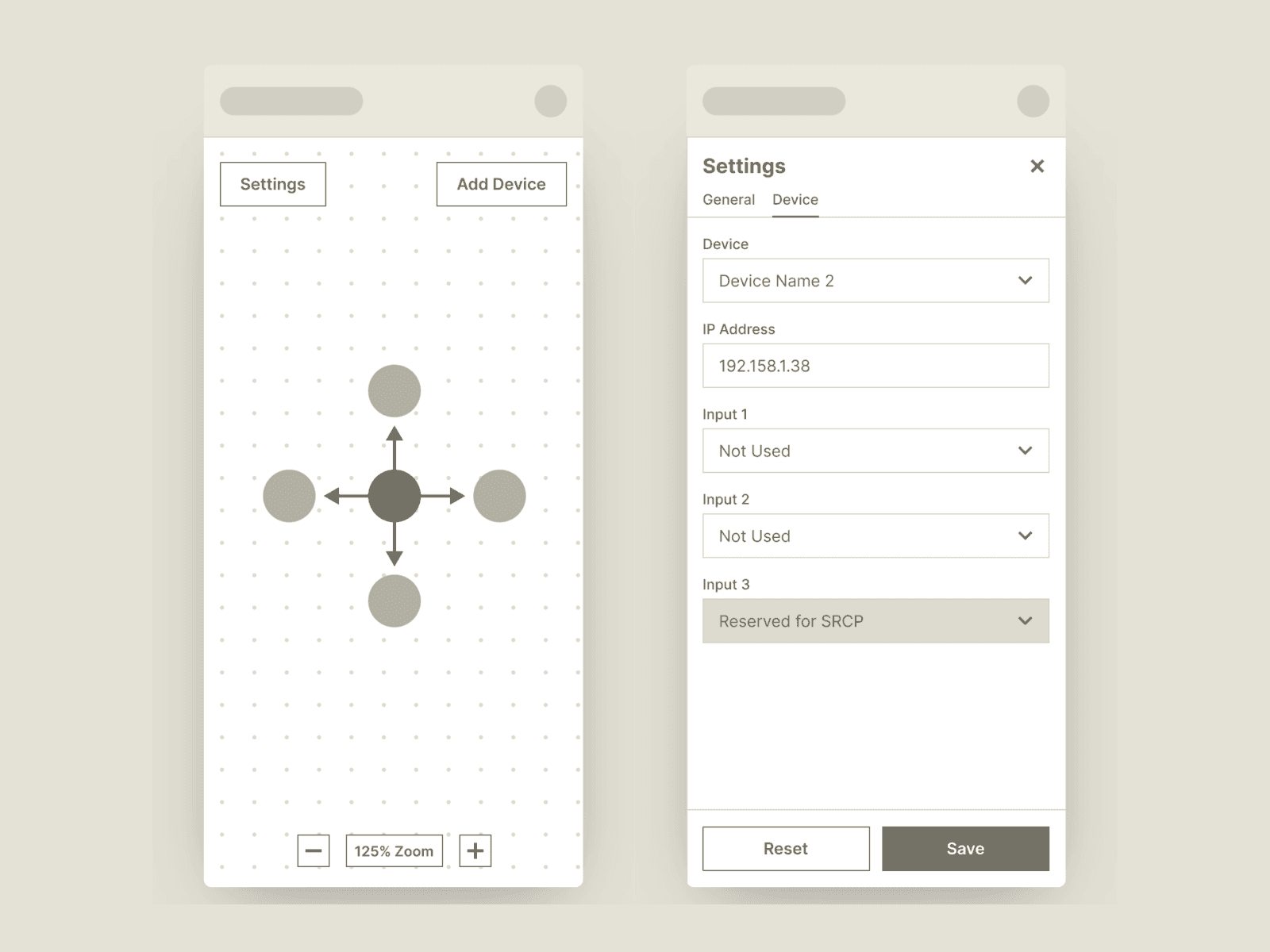
The core feature of the platform was “Configurations”. This enabled users to tell the system which hardware devices they wanted to use with one another (E.g., One remote control connected to 10 receivers) and how they should work (E.g., Use Wi-Fi or Bluetooth?). The existing platform used a drag-and-drop “node” pattern that became a nightmare to use at scale and on mobile.
Global E-Stop
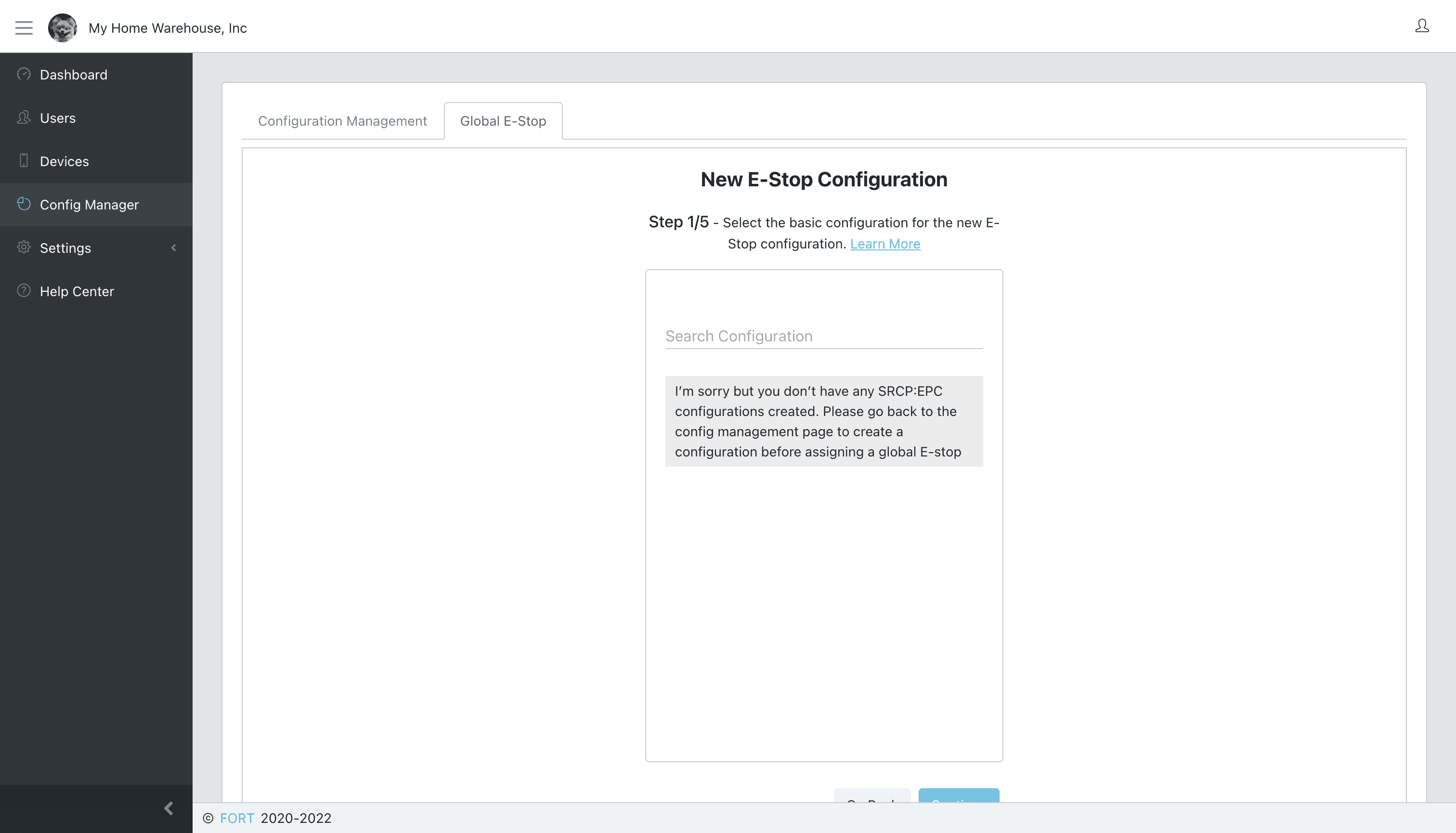
The primary purpose of FORT devices is to enable humans to stop automated machines—wirelessly. A related key feature was the ability to have a single device stop everything at once from a central location; this was “Global E-stop”. The issue was that to enable this feature, you had to complete an entirely separate step after creating a new configuration. It was not intuitive and confused a lot of people.
Device Compatibility
I’d learn how bad this was over time, but we knew up-front that certain FORT devices did not work with each other, or had limitations. This would cause confusion during set up, or worse, make the configuration not work at all (without any feedback why).
Goals and Principles
Primary Metrics
Increase the total number of configs created on the platform
Reduce the amount of time it takes to create a config
Reduce the amount of time required to launch new FORT devices on the platform
Design Principles
I championed the following design principles as we moved from discovery to solution mode to help guide the direction of the work.
Exploring Solutions
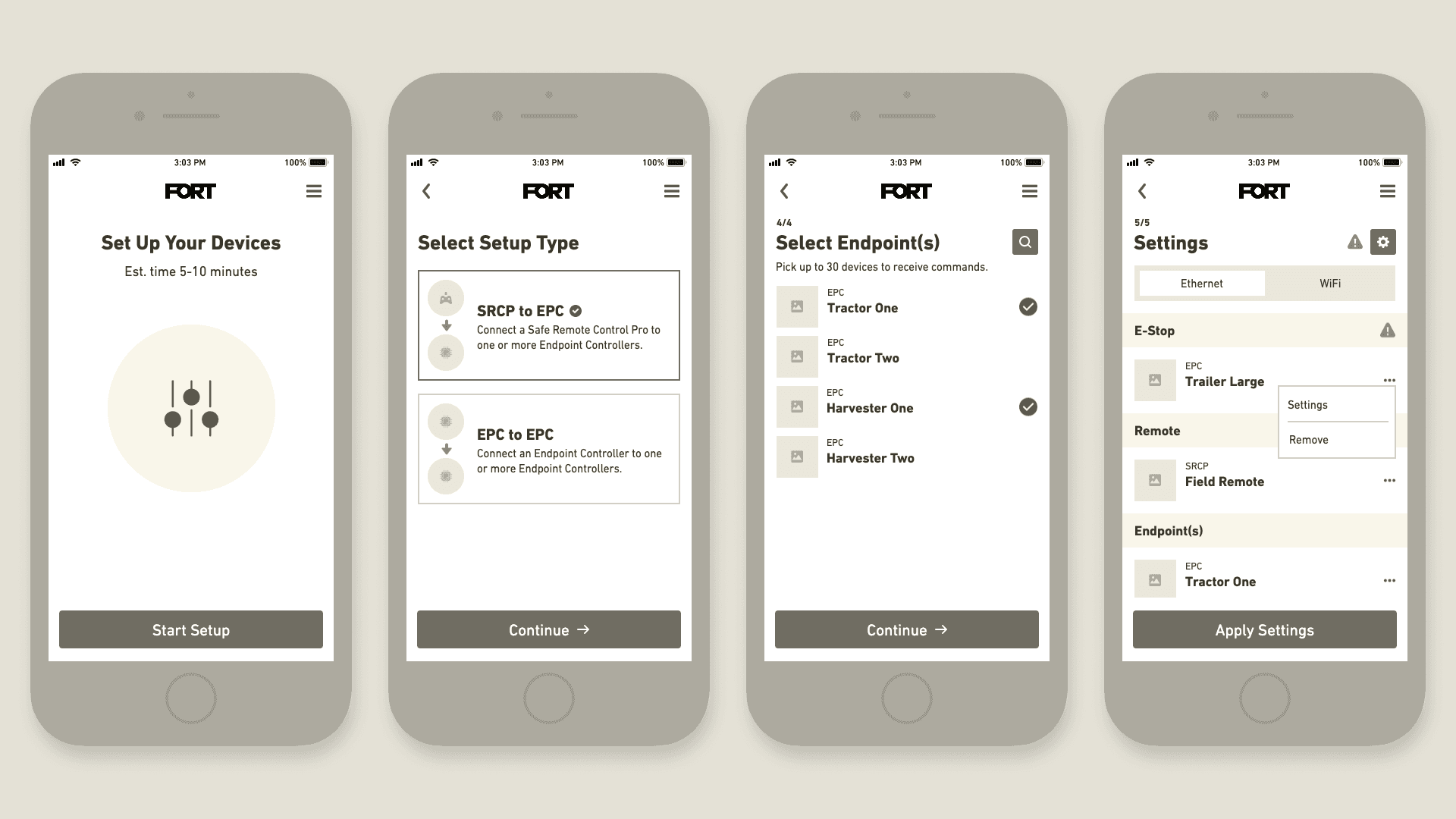
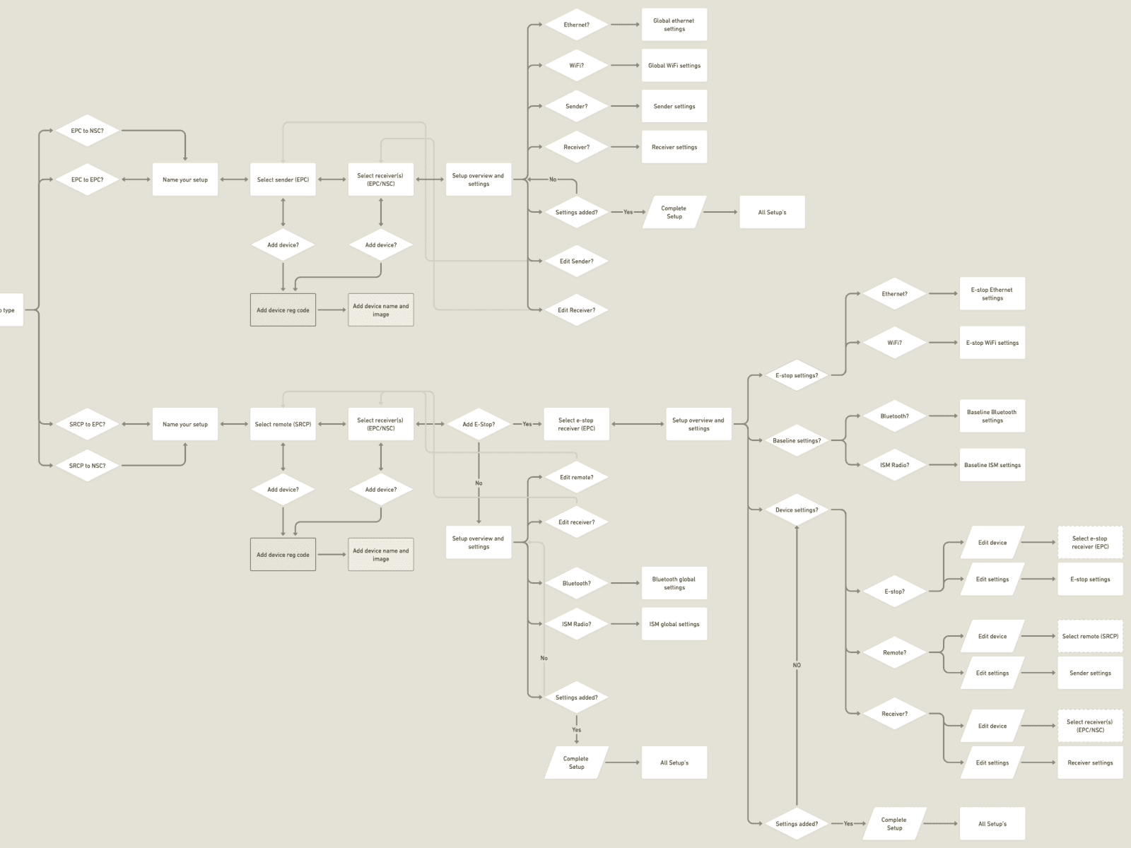
After I facilitated a Design Studio workshop with team members from different parts of the org, we consolidated some of the top solution ideas to begin exploring. In the early stages, we focused on workflows and wireframes to define the steps for initiating and completing a configuration. We adopted a linear model to guide users through the steps sequentially and improve self-service for first-time users. We also considered alternative approaches, such as enhancing the existing node model and different settings panels.
Gathering Feedback
After gathering feedback on various design concepts, we put a rough prototype through its paces in a design critique. The mobile-first approach was key, and the feedback revealed areas for improvement, including making users feel more confident about selecting settings, making it easier to edit configs, and ensuring users could save their work without worry. With this feedback in mind, we updated the prototype (see video).
Pushback
Using the prototype, we collected feedback from internal stakeholders and two usability studies (one external, one internal). Several of the engineers were very vocal about their concerns, which included:
Addressing Feedback
A lot of the feedback we received came in late and we were up against a deadline to ship something ASAP. I reminded the engineering teams that we now had a platform infrastructure that would enable us to ship iteratively, unlike the existing platform. I also pushed for a proper analytics package to be installed before launch, so we’d now be able to monitor usage and react in real time if we saw users having issues. Some of the accessibility concerns were bigger lifts, but our team committed to exploring new global patterns moving forward that we could retroactively update at a later date.
Final Solution Highlights
The revised platform was released in two phases, everything except Configs, and then the entire Config feature. The release took longer than expected (2+ months over), but was a drastic improvement compared to where it all started.
Improved visibility
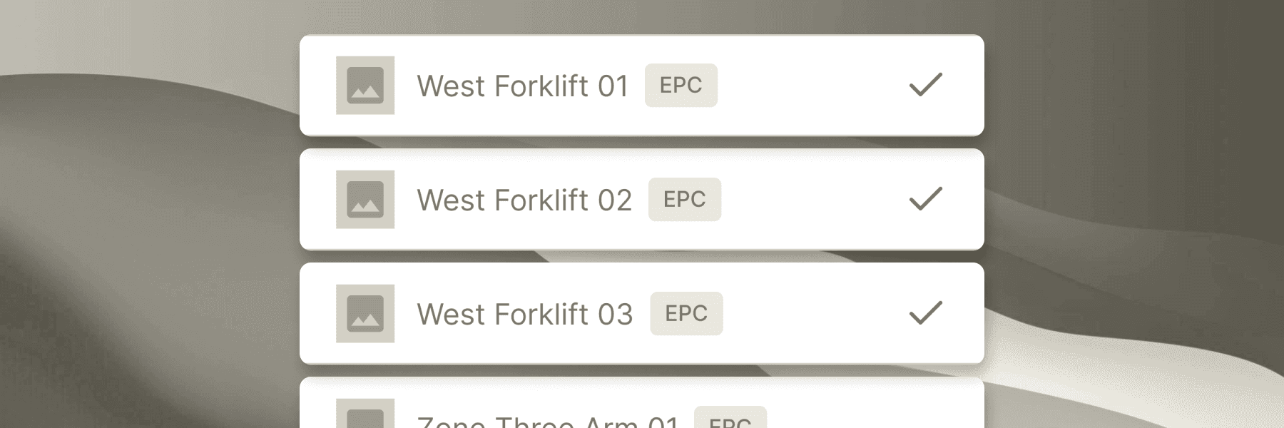
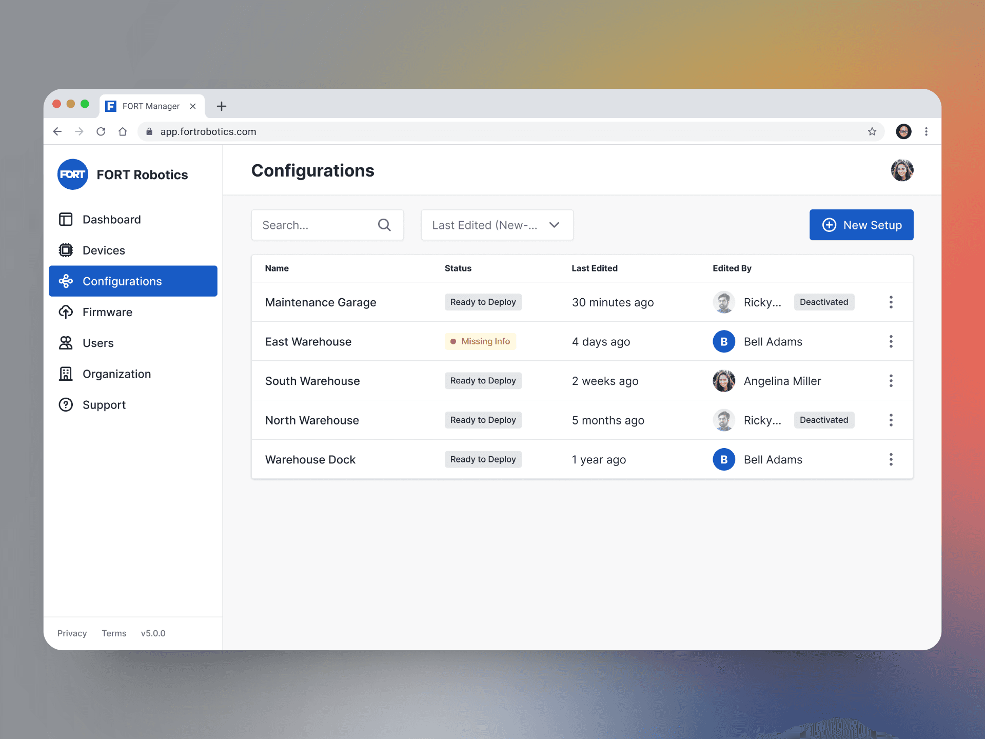
We developed a standalone All Configurations view, maintaining layout consistency with other pages like Devices and Firmware. We improved visibility by displaying who last edited the configuration and when. Notably, we introduced configuration statuses, including a draft version, allowing users to resume where they left off.
Outcomes versus devices
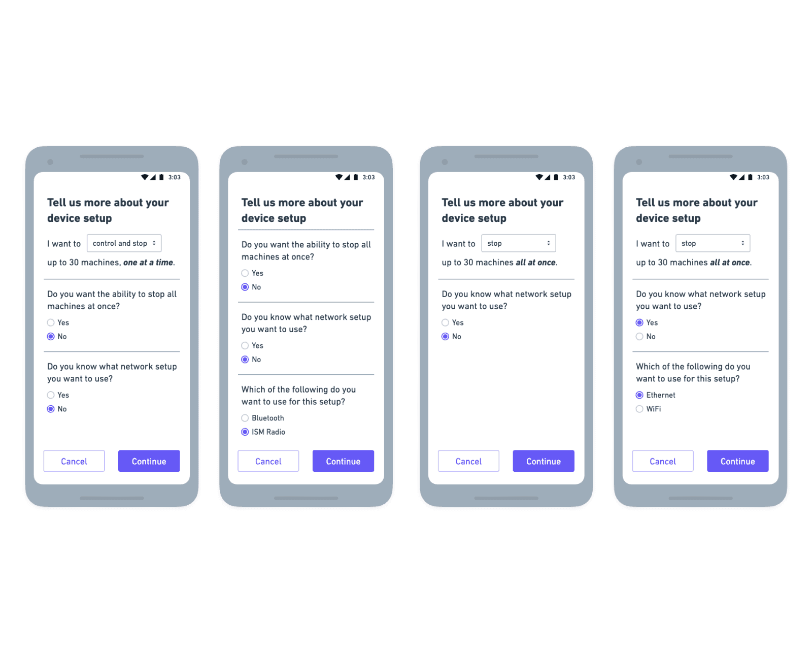
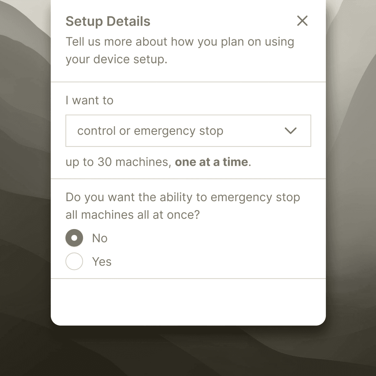
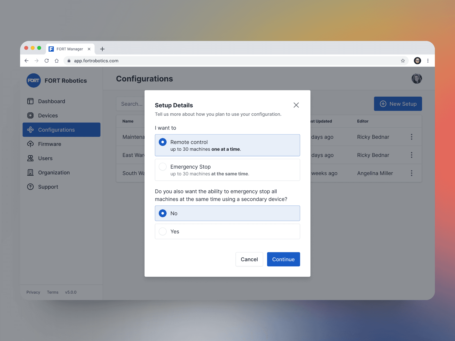
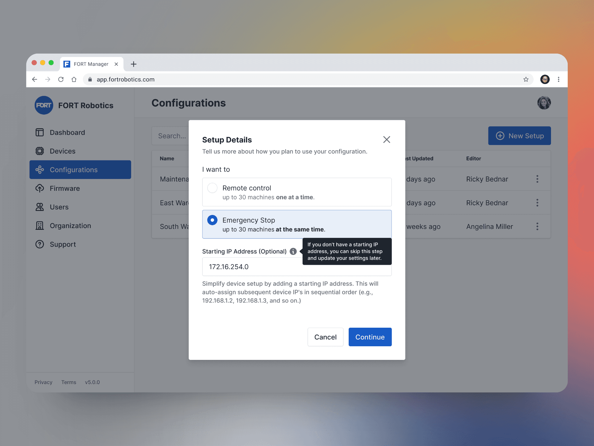
Each configuration starts with a simple wizard to help users navigate toward the appropriate configuration path based on their intended outcomes, rather than on connecting specific devices.
Saving users time and frustration
In the previous app version, users inputted unique IP addresses for each device. We introduced a "Starting IP" field, auto-populating all devices with incremental IPs from a single address, saving time and reducing complexity.
Keeping users on track
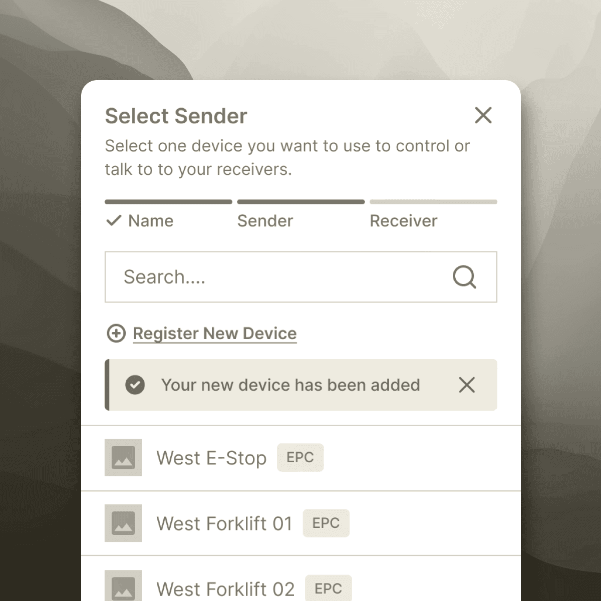
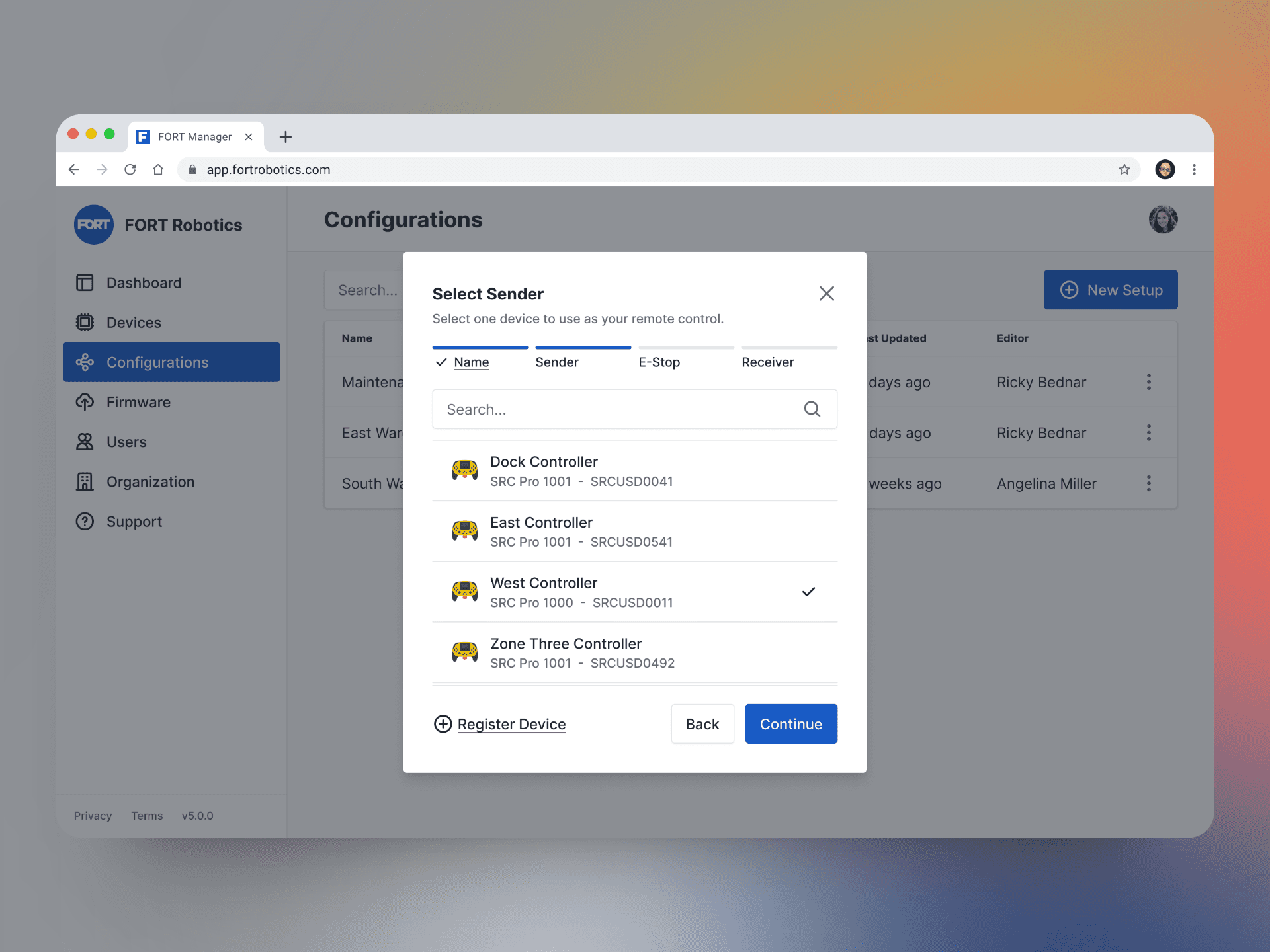
Users are guided through each step, reducing errors compared to the open-canvas model. Previously, adding a "Global E-stop" required an extra step after completing a baseline configuration. The new version seamlessly incorporates this into the step-flow process. Additionally, users can register a new device while creating a configuration, eliminating the need to navigate to the Devices page.
Managing configs
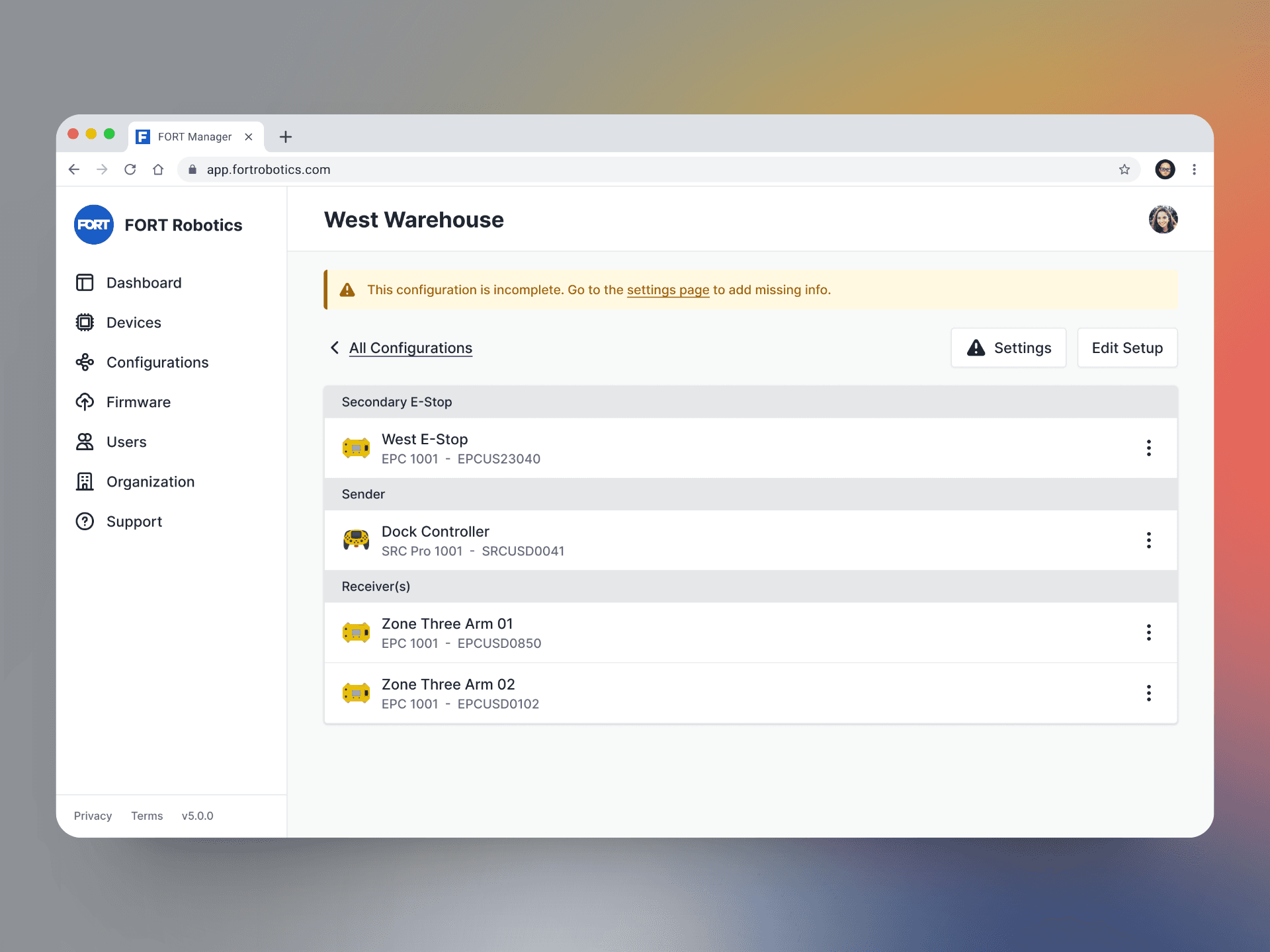
The shift to a list-based model aimed to enhance scalability and improve mobile usability. The final solution enables users to add or modify devices in their configuration with just a few taps. To boost completed configurations, we emphasized required settings and exposed device model and serial numbers for easier identification during setup.
Reducing settings complexity
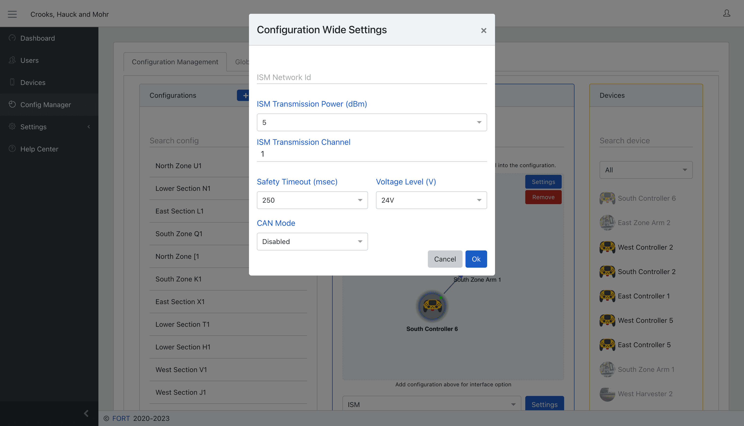
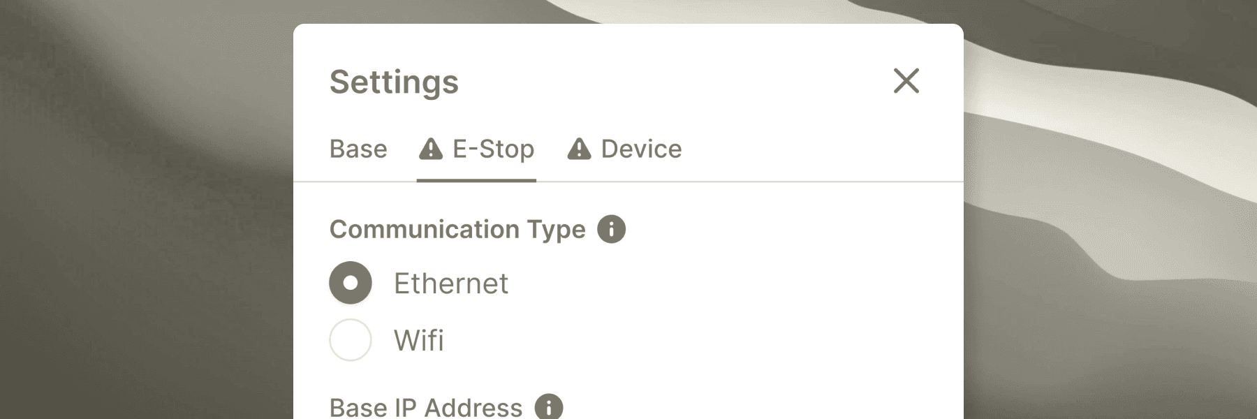
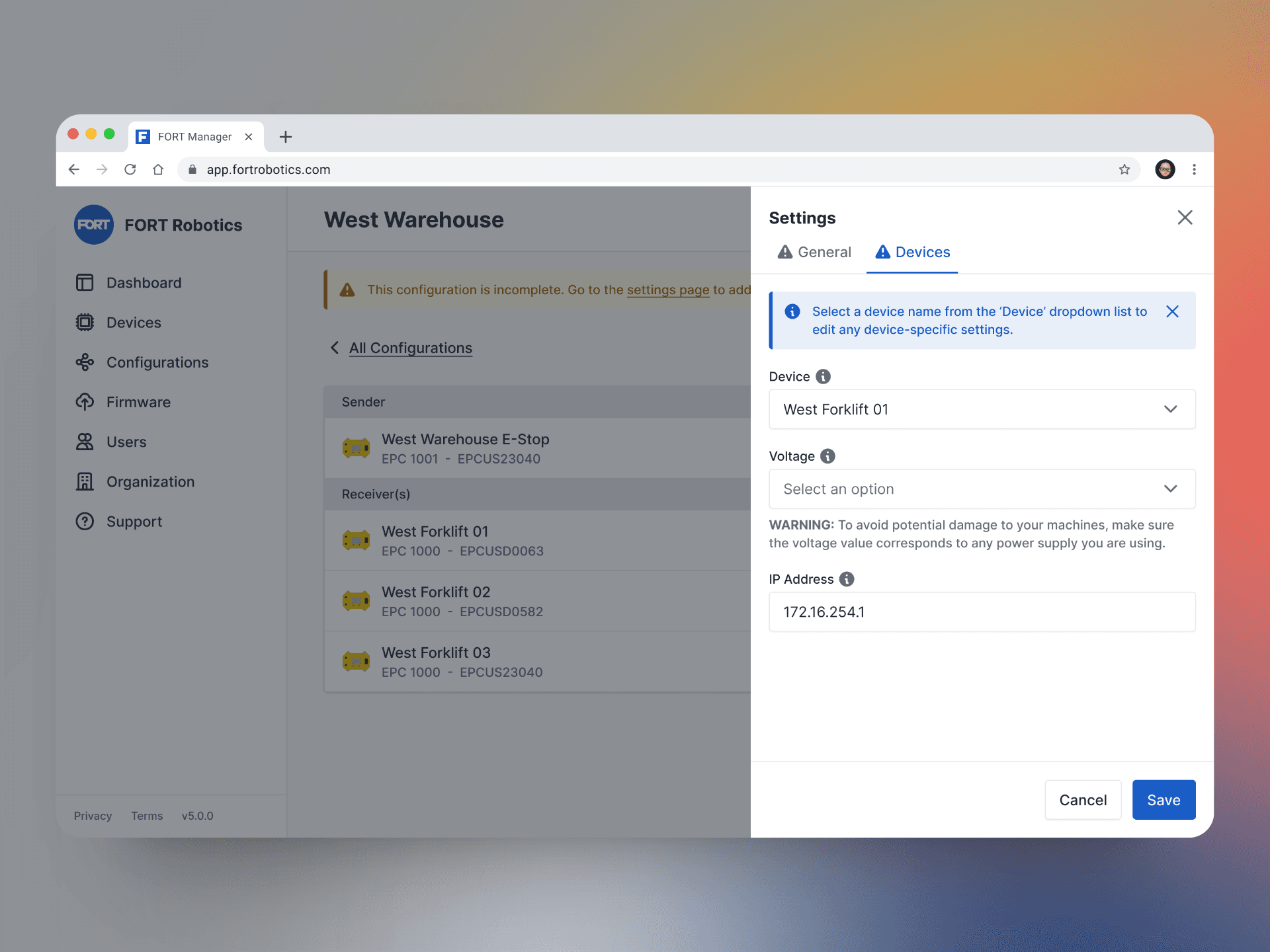
We improved configuration settings by organizing logical groupings within a tab interface and implemented progressive disclosure to reduce cognitive overload. Users can manage each device from a single tab using a drop-down menu or the overflow menu on the configuration summary page. Additionally, we added tooltips and inline copy for extra assistance and context in technical fields.
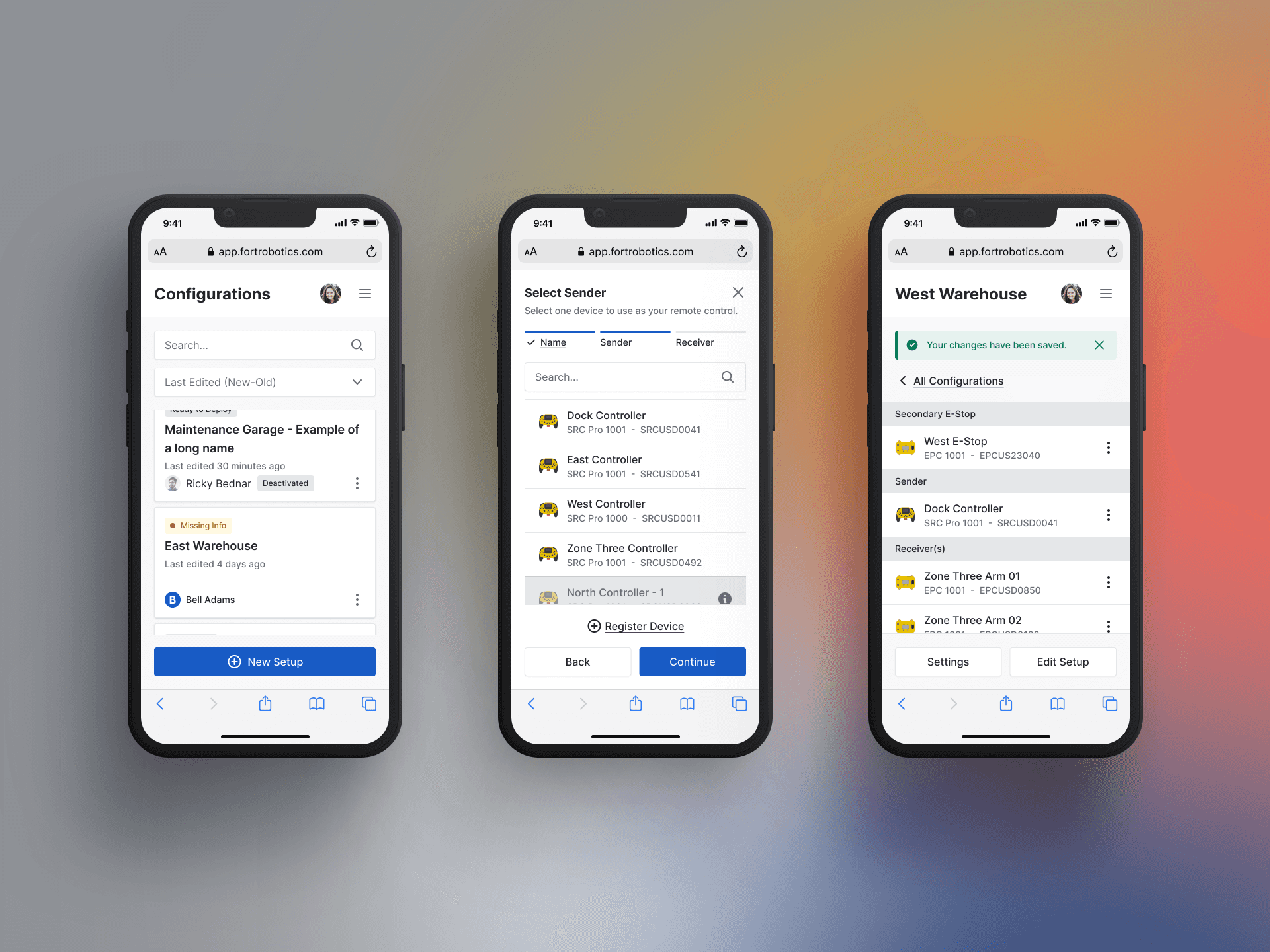
Mobile from the start
The configuration redesign prioritized mobile-first design, resulting in a seamless mobile-web experience. Users can manage configurations from mobile devices, facilitating fieldwork and effortless changes. This also sets the stage for future capabilities like BLE-enabled updates.
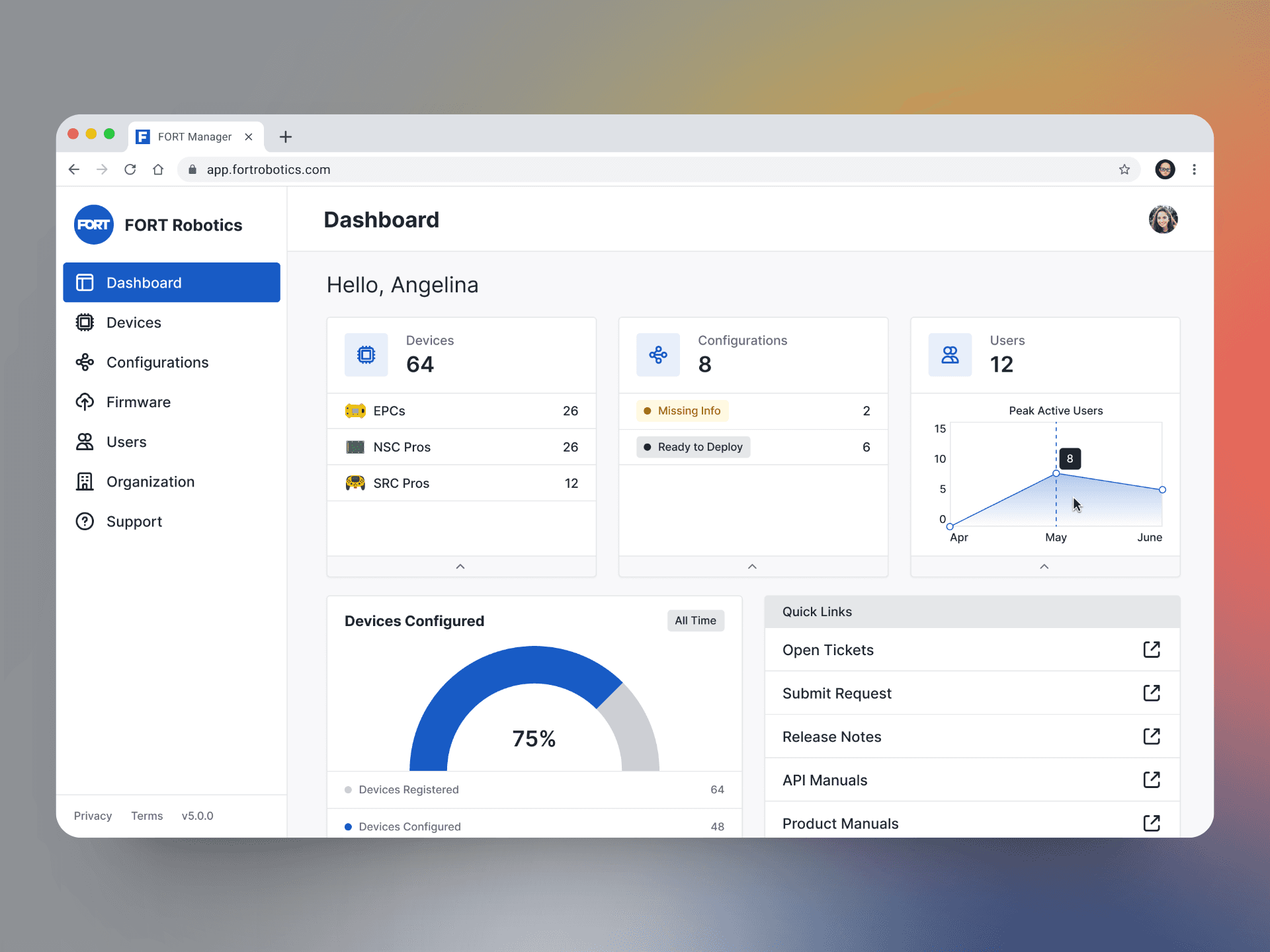
We touched everything
This case study primarily focuses on the Configuration feature, but we revamped all aspects of the app, including a new dashboard view. This enabled customers to quickly understand their activity and set the stage for additional data-focused modules.
Zooming in
Edge Cases
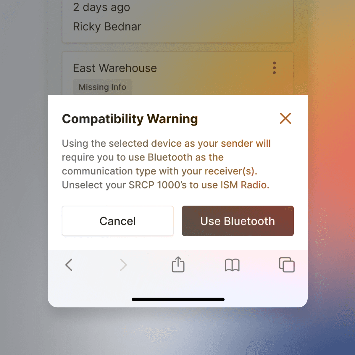
We identified all compatibility issues related to model numbers and communication types, creating user-friendly prompts to guide users appropriately.
Critical Settings
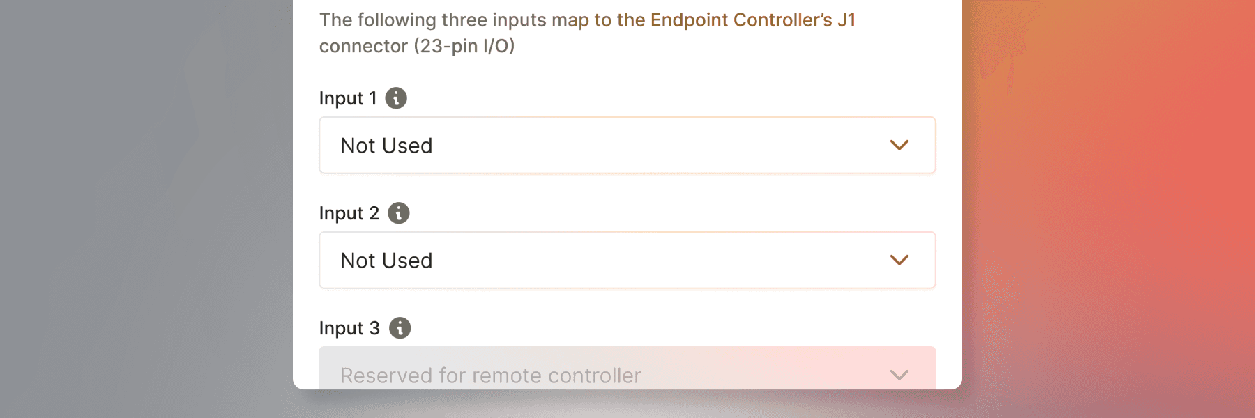
Certain fields must be completed before deploying the configuration. We aimed to minimize the total number of fields, reduce technical jargon, and incorporate clear validation and help text to enhance conversion rates.
Supporting Changes
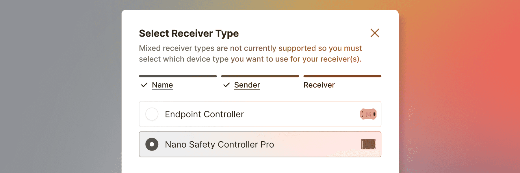
FORT introduced a new receiver type. The new stepper design facilitated quick adjustments by adding one extra screen to select the type, as mixed receivers were not yet permitted.
Device Limitations
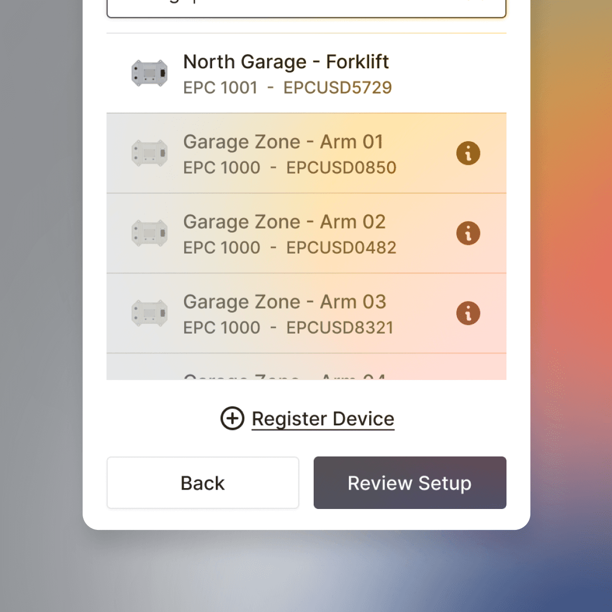
A receiver could only be used once across all configurations, with a limit of 30 per config. We implemented clear disabled states and tooltips to inform users about these limits.
Outcomes
Almost immediately after launch, we began to learn more about our customers' behavior than we had in previous months; some good, some bad.

