O'Reilly Media

Increasing content consumption by ~15% with new outcome-driven navigation

Increasing content consumption by ~15% with new outcome-driven navigation

I led the team through a multi-phased platform redesign, starting with new global navigation. The new nav increased content consumption by an estimated 15%, improved customer satisfaction, reduced marketing spend, and improved sales enablement.

2022
Design Leadership, Information Architecture
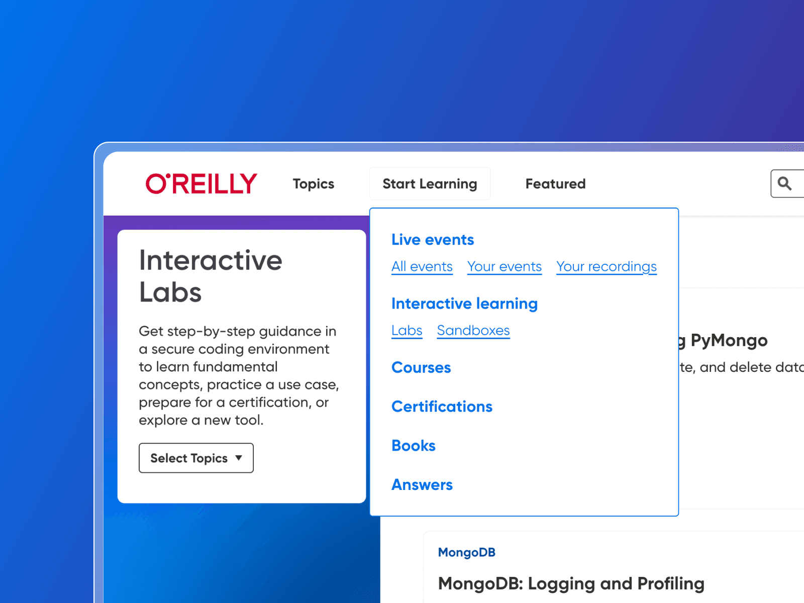
Cropped image of new O'Reilly navigation showing 'Start Learning' menu and options.

Overview

One reason I was hired as the Product Design Director at O’Reilly was my ability to share a large-scale product vision for how I believed the learning platform could evolve. A major part of this vision involved overhauling the app's information architecture. While multiple teams provided valuable product briefs and insights, it was my responsibility to gain buy-in and ensure a successful outcome.

About O’Reilly

O’Reilly is an enterprise SaaS learning company with an estimated $160m ARR. Their online platform helps train millions of tech professionals from companies like Amazon, Netflix, and IBM. They offer exclusive live events, coding, certifications, books, videos, and more.

Problems

There were a number of known issues with the existing navigation, however, we faced three main problems:

The Choice Dilemma

Users of the platform encountered overwhelming choices on the app’s homepage and sidebar navigation. This ultimately reduced productivity and caused people to spend more time looking for content versus consuming it.

Modality-First

Content was mostly grouped by type (E.g., 'Live Events' or 'Interactive') versus topics that users were interested in. This led to a lot of noise which distracted from the user’s learning goals.

Promotion & Discovery

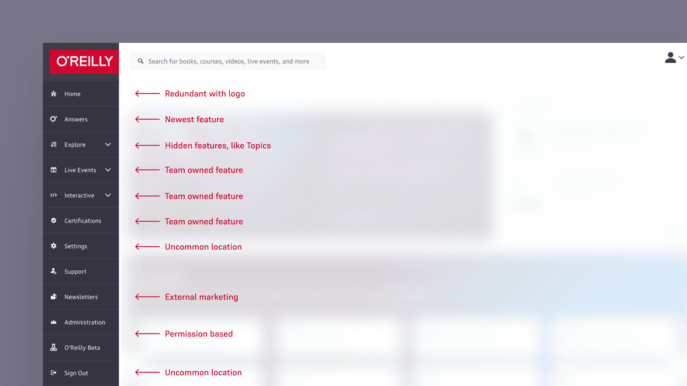
The existing navigation mirrored the org chart, with each product squad owning one or more sections. Each new feature often added another menu item, forcing users to constantly re-learn where to find their favorite features.
Cropped image showing existing sidebar navigation of the O'Reilly learning platform.

Analysis

Data

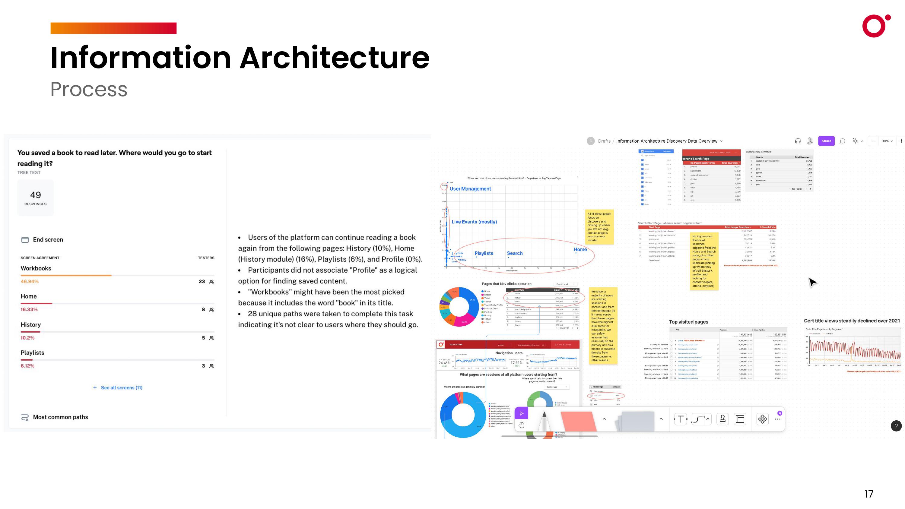
  1. Beyond landing on a homepage with nearly 143 options, the primary navigation adds 26 more options plus six more in the user profile menu. A clear example of Hick's Law—The more stimuli to choose from, the longer it takes to make a decision.

  2. Rather than click through our lengthy navigation, users commonly default to using our platform search, where more than 20% of their queries are for broad topic areas, echoing their topic-first mental model.

  3. When an event landing page was on the platform without marketing, we saw 86 registrations in the first week. When marketing was added, we had 770 registrations per week (795% lift over landing page).

Image showing multiple data analytics views and research notes.

User Feedback

Research found that the platform's navigation is confusing, with too many unclear menu options and inconsistent elements. Numerous options are ambiguous and require clicking into the contents to understand what they mean. Key functions like search, user management, and new features are hard to find, while certain page layouts and labels add to the cognitive load. Settings and support are in uncommon locations, further complicating usability.

example end-user profile photo

“The amount of content for some topics is so overwhelming, that it would be good to have a ‘DJ’ that picks the beauties for a certain topic." —B2B User

The Customer Support team frequently comments that their administrators “don’t understand how to search” and need consistent hand holding through the discovery and curation process. Some sales reps also have created their own “cheat sheets” with popular topics and links directly to content to help arm themselves in sales conversations because it's not always easy or quick to find specific topics.

Goals and Principles

Objectives

  1. Increase “Time to Value” for all subscribers (I.e., reduce time scanning content and increase time consuming it).

  2. Increase awareness of new product features.

  3. Attract potential investors by shifting perceptions from being a “content library” to a “true learning platform”.

What is the ideal user experience?

man holding a hat as he scratches his head

Intuitive

Users understand the options shown to them without needing to think.

man holding a hat as he scratches his head

Intuitive

Users understand the options shown to them without needing to think.

man holding a hat as he scratches his head

Intuitive

Users understand the options shown to them without needing to think.

man looking at several options in a line of vending machines

Consolidated

Users are presented with fewer choices that create more impact.

man looking at several options in a line of vending machines

Consolidated

Users are presented with fewer choices that create more impact.

man looking at several options in a line of vending machines

Consolidated

Users are presented with fewer choices that create more impact.

light shining down a dark staircase

Progressive

Additional options are revealed to users only as needed.

light shining down a dark staircase

Progressive

Additional options are revealed to users only as needed.

light shining down a dark staircase

Progressive

Additional options are revealed to users only as needed.

visual color pallete and material swatches

Branded

The nav expresses the O’Reilly visual language and modernizes the look & feel of the platform.

visual color pallete and material swatches

Branded

The nav expresses the O’Reilly visual language and modernizes the look & feel of the platform.

visual color pallete and material swatches

Branded

The nav expresses the O’Reilly visual language and modernizes the look & feel of the platform.

Research

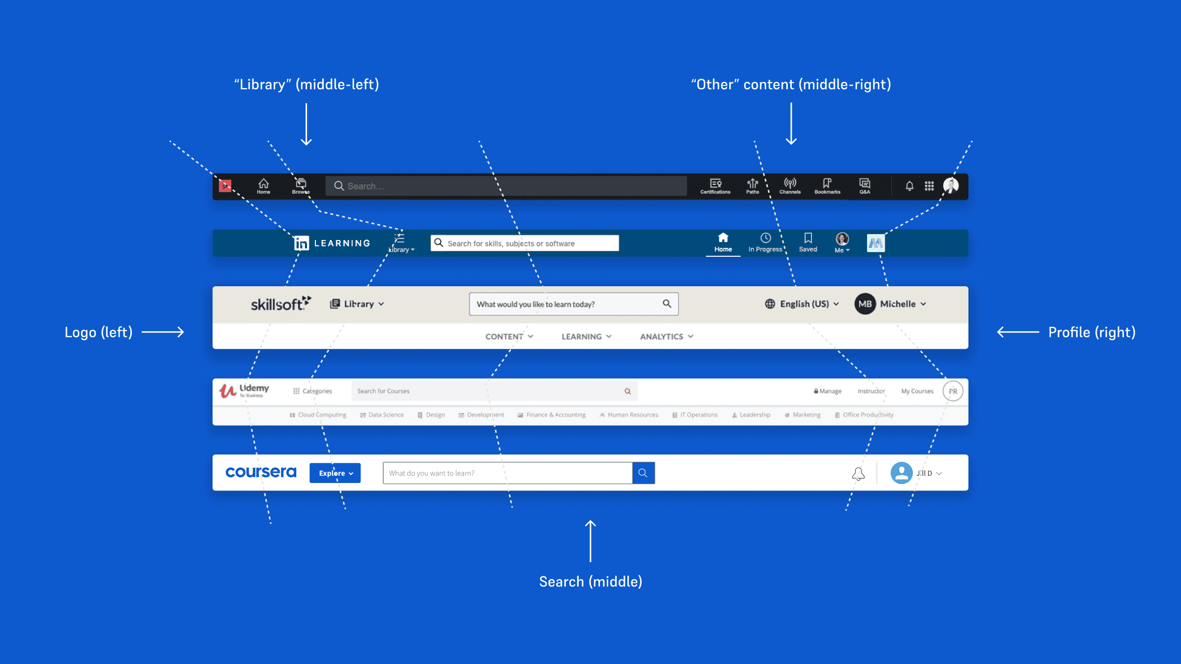
image showing ux competitive analysis of competitor navigation menus

I first looked at competitors like Pluralsight, LinkedIn Learning, Skillsoft, Udemy, and Coursera, which had streamlined navigation with a clear entry point for browsing content and an ever-present search bar. They also highlighted available skills and topics, providing a straightforward user experience.

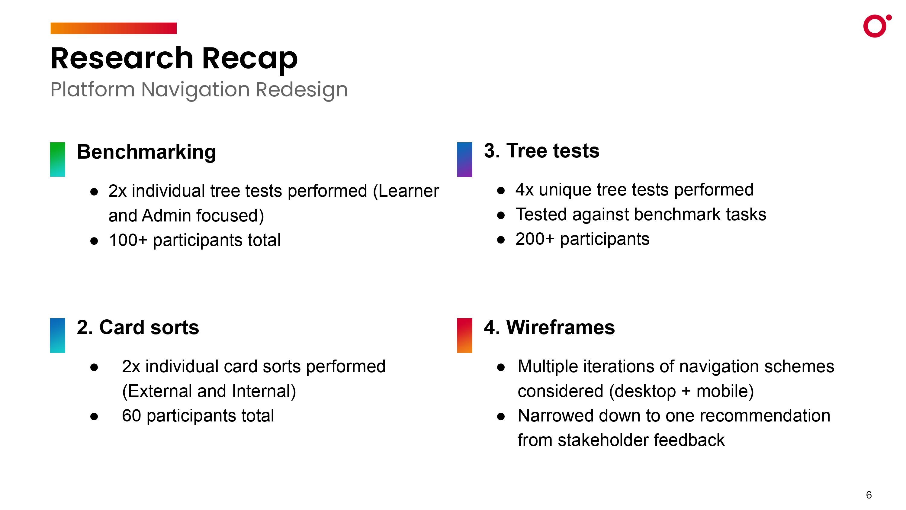
slide showing text bullets of research steps completed, including benchmarking, tree tests, card sorts, and wireframes

Diving deep

Leveraging the original product vision, a deep product brief, and existing research, I paired two designers to handle the bulk of the execution, encompassing benchmark testing through visual design. This involved conducting card sorts to grasp user mental models and establish logical content groupings within the learning platform. Iterative site maps were crafted and subjected to tree tests, focusing on achieving an intuitive architecture with minimal clicks.

Differences in opinion

The Design team believed the navigation could be very simple, only including Topics, Search, and a user Profile. The assumption was that once a user found the topic they liked, they would discover all of the available content types related to that topic. However, leadership worried that hiding or removing popular nav items like Certifications, Playlists, and Live Events would result in decreased engagement. And the business wasn’t wrong in thinking this. Playlists were the most used feature on the platform, with Live Events generating the most revenue, and Certifications gaining rapid adoption. We needed to tread with caution.

looping gif showing different iterations of navigation sitemaps

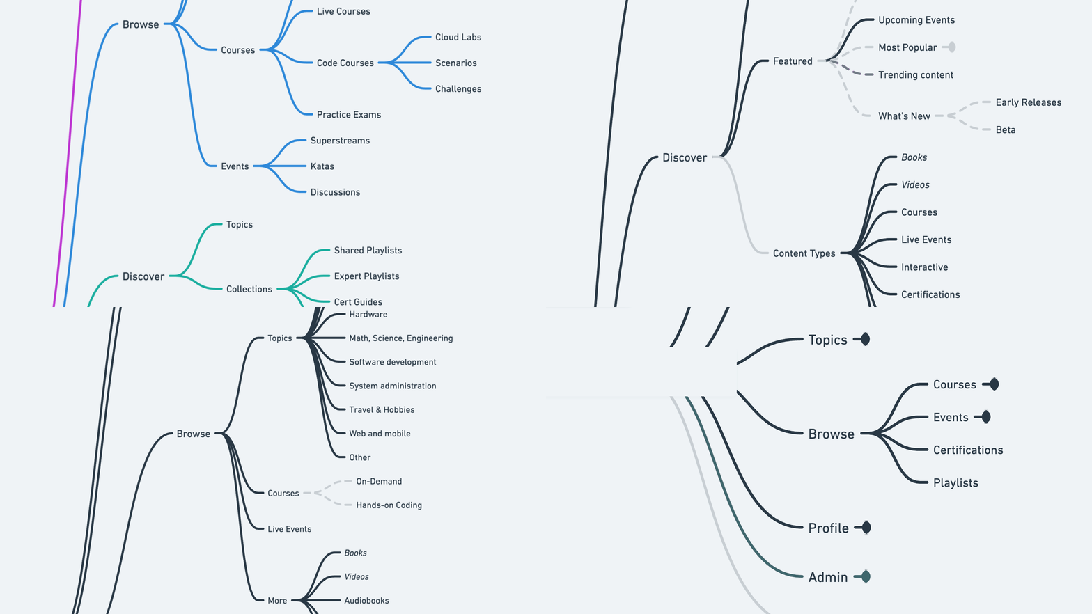
This led us to experiment with different site map variations that included both Topics and popular content types like books and videos. The biggest challenge was finding a single label that intuitively represented the entire group. We tested words like 'Browse', 'Discover', and 'Explore', but none of them were clearly understood.

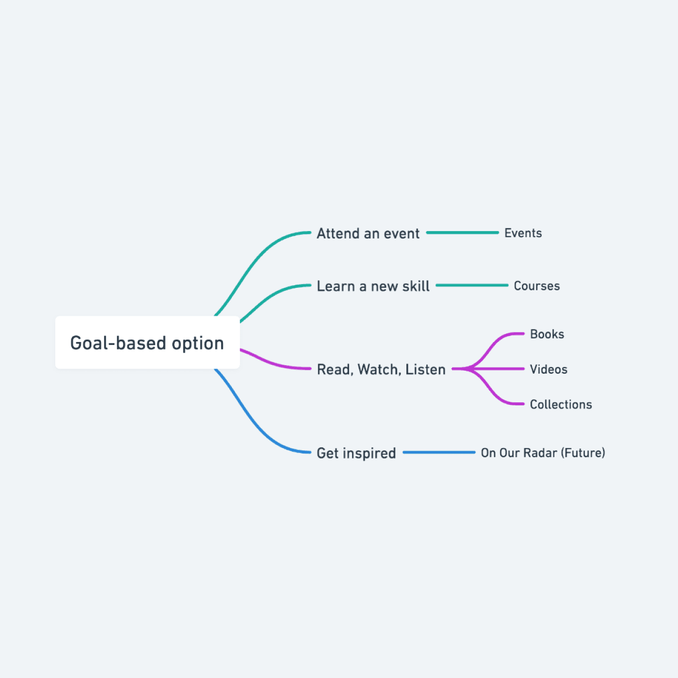
sitemap showing goal-based nav menu options

This led us to experiment with different site map variations that included both Topics and popular content types like books and videos. The biggest challenge was finding a single label that intuitively represented the entire group. We tested words like 'Browse', 'Discover', and 'Explore', but none of them were clearly understood.

looping gif showing search sub-menu interaction

We also tested a more subtle version that exposed popular content types when you focused the search field. This seemed like a good middle-ground approach, but business stakeholders weren’t sold on the idea. The data agreed. For example, the ‘Certifications’ menu item had a 60% directness score when users were asked “How do you prepare for an upcoming AWS exam?” Without more obvious top-level groups, we’d be risking decreased engagement and higher user frustration scores.

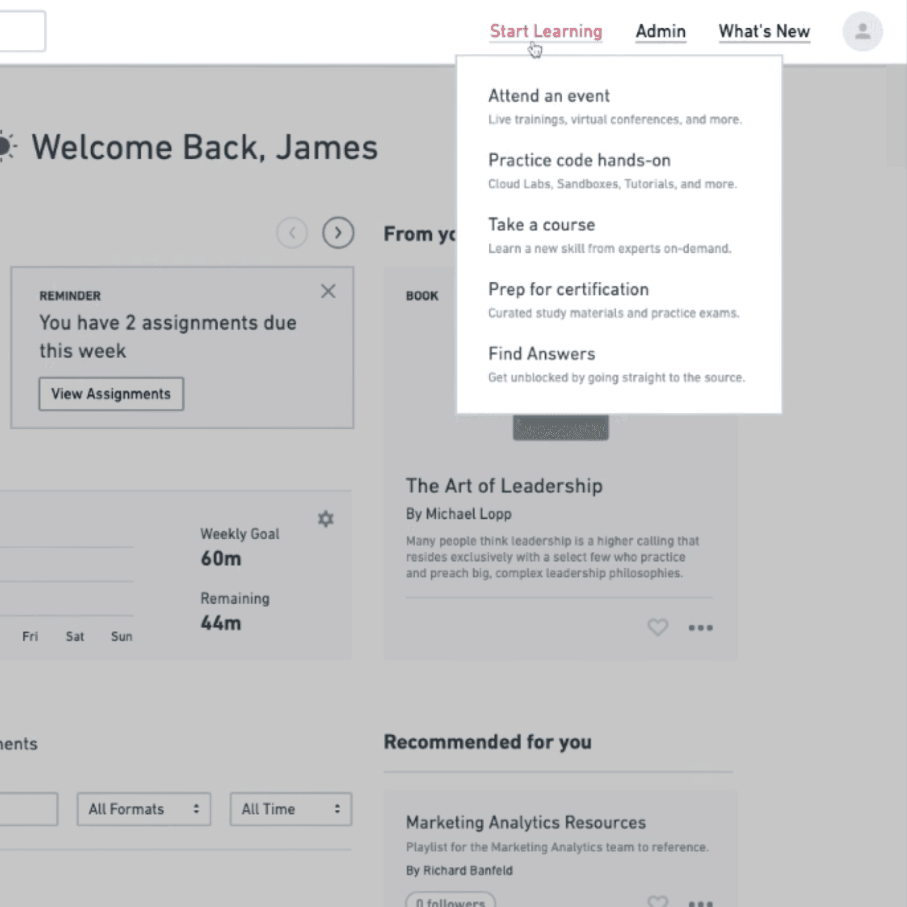
wireframe image of start learning menu

We also tested a more subtle version that exposed popular content types when you focused the search field. This seemed like a good middle-ground approach, but business stakeholders weren’t sold on the idea. The data agreed. For example, the ‘Certifications’ menu item had a 60% directness score when users were asked “How do you prepare for an upcoming AWS exam?” Without more obvious top-level groups, we’d be risking decreased engagement and higher user frustration scores.

Solution

After some consideration, I introduced the concept of goal-based navigation. For example, “Learn a new skill” could lead you towards Courses, Videos, or Learning Paths, and then be filtered by topic. Through multiple iterations and feedback, this evolved into a single CTA, “Start Learning” with popular features grouped under it. This not only bridged the gap between topics and content types for our users, but it was also a good compromise between design and key stakeholders.

sitemap showing goal-based nav menu options

Action oriented

Not all users would want to narrow results by topic, so giving people a path to explore by their preferred learning style made sense.

wireframe image of start learning menu

Contextual

Adding a short descriptor below each menu item helped reduce the risk of accidental clicks, reducing frustration and increasing TTV.

What launched

Regrettably, I departed from O'Reilly during the development of these features. Nevertheless, the work was released to the public sometime in 2023 in the following state.
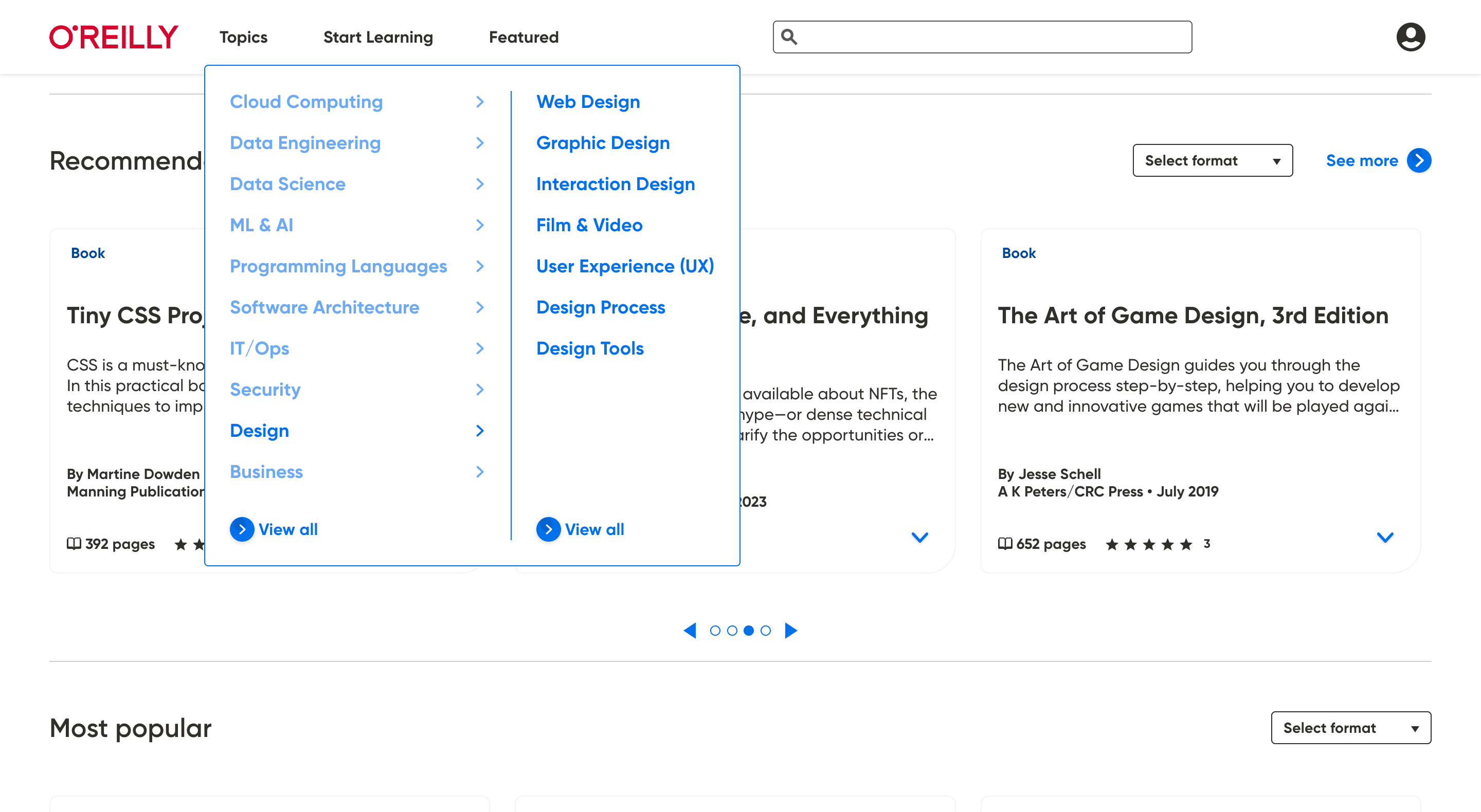
  • new o'reilly navigation topics menu expanded

    Learner-first, not content-first

    Browsing is now focused on the topics and information users are interested in versus all the different methods by which they can consume content.
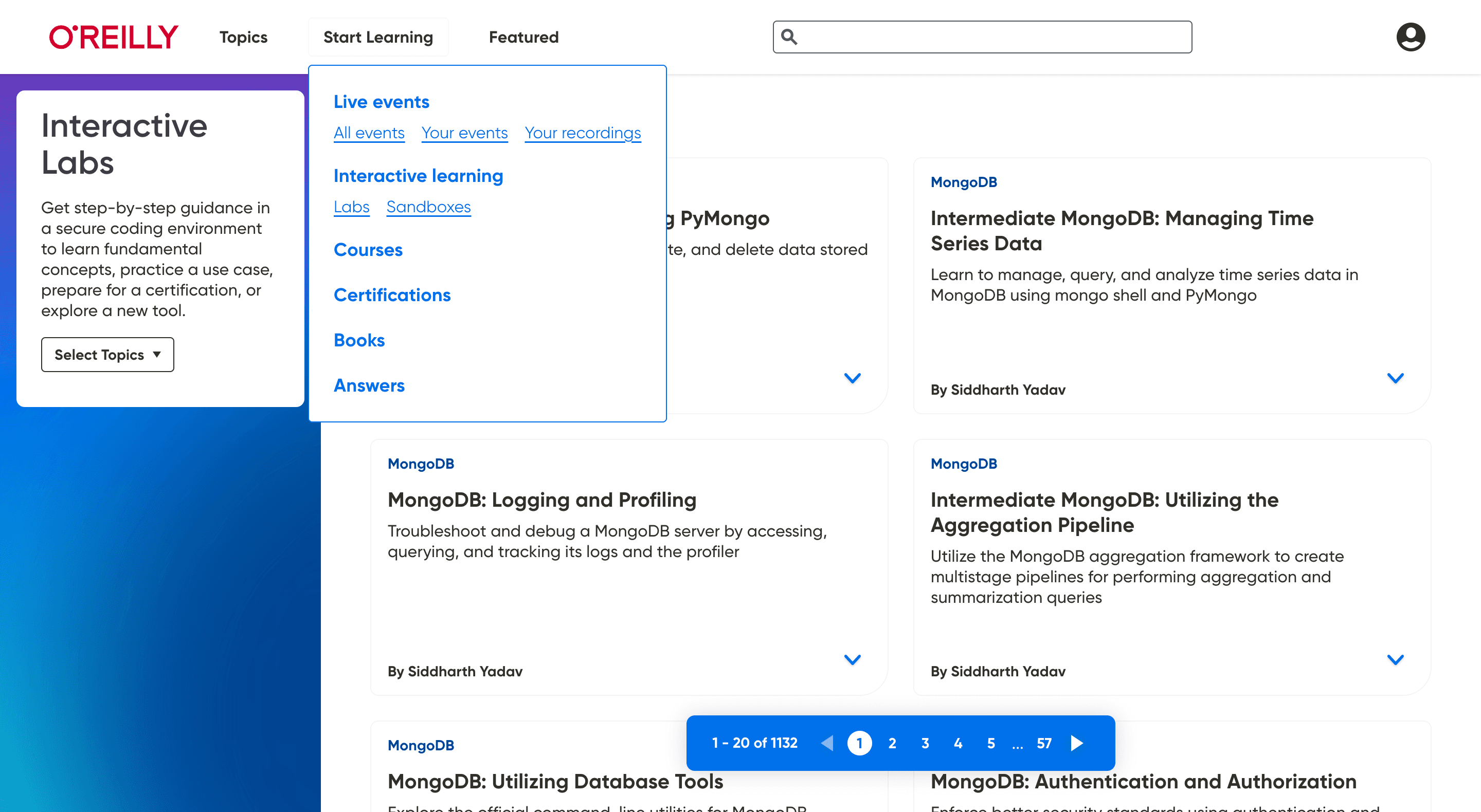
  • new o'reilly navigation start learning drop-down menu

    Striking a balance

    For users that are "exploratory seeking", surfacing the core competencies of the platform enables users to easily discover the different learning options available.
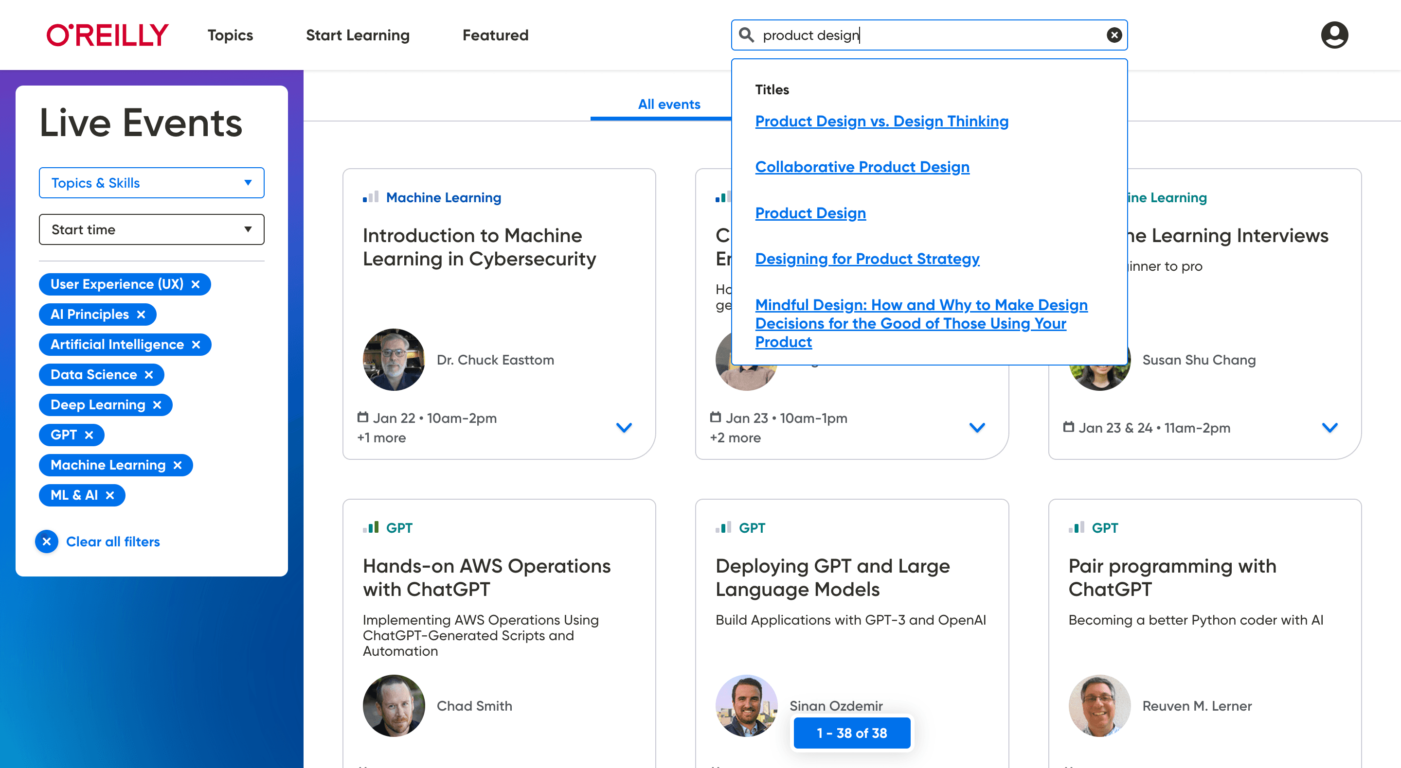
  • new o'reilly navigation global search

    Global search

    While mostly the same functionality, users can now search from any page in the app, and type-ahead results include top hits from related topics & authors.
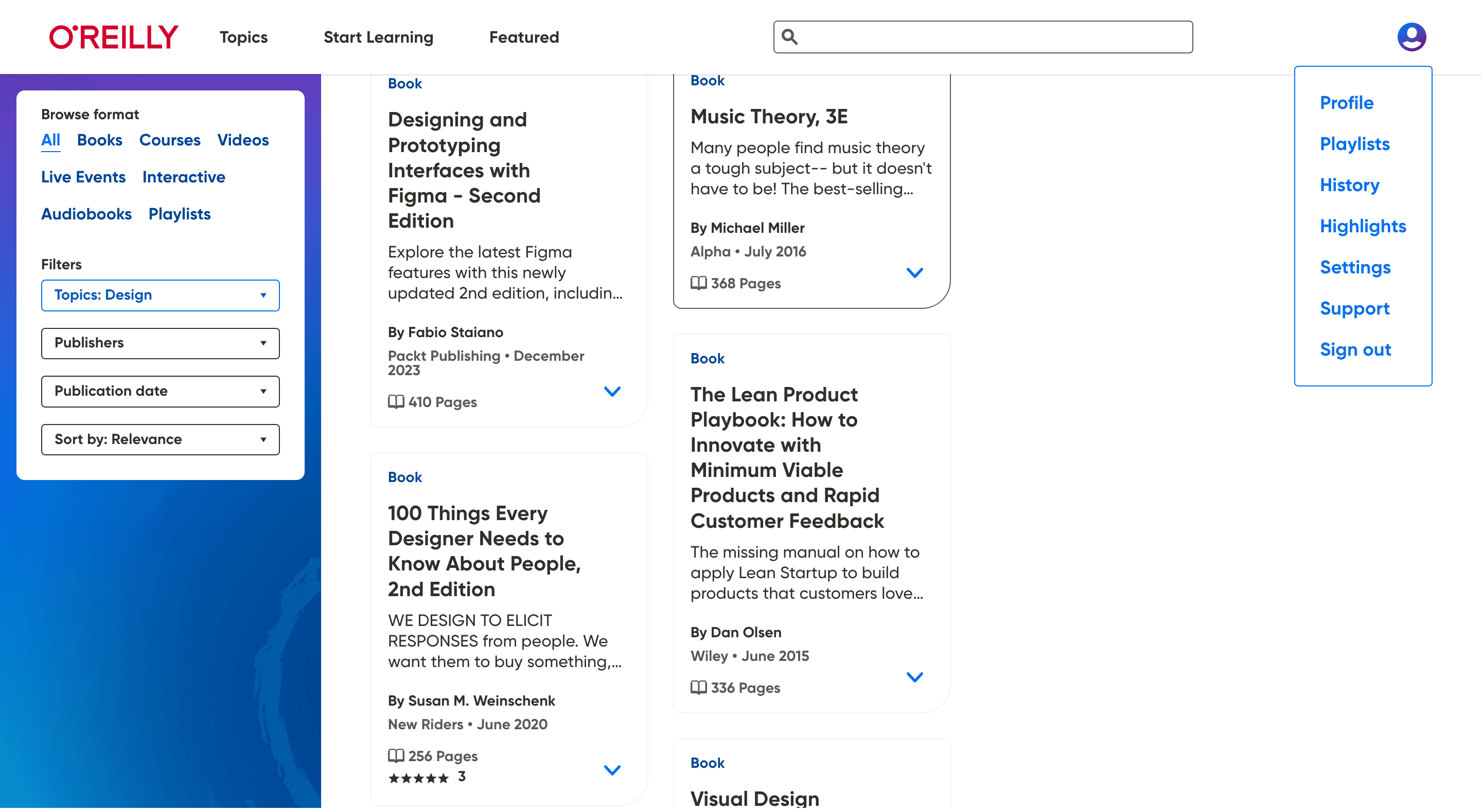
  • new o'reilly navigation user profile menu

    Uniform browsing

    Common links like "Sign Out" are now in their expected location on the page and the user profile menu no longer changes location when using the Reader interface.
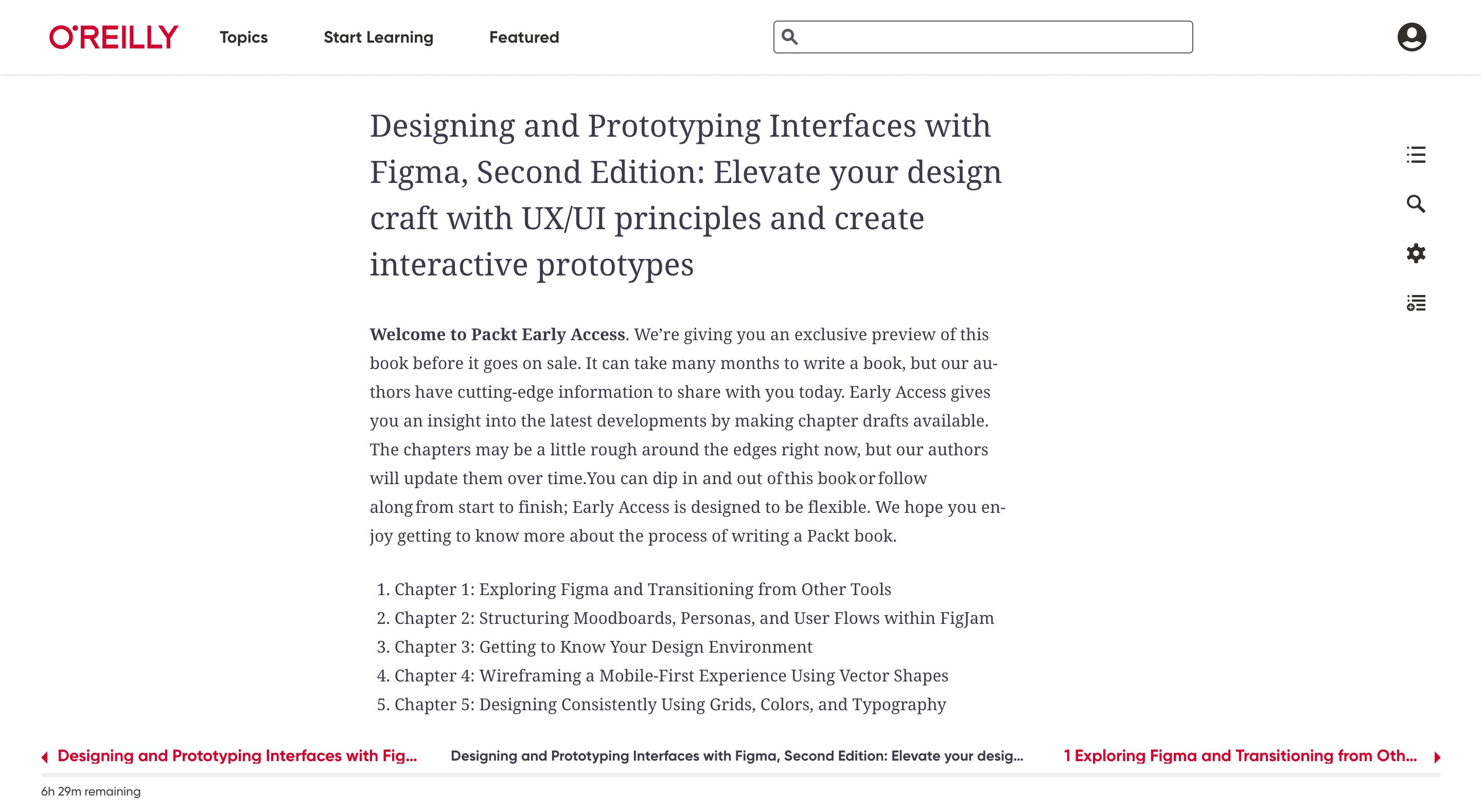
  • new o'reilly navigation on reader interface

    Seamless viewing

    The existing nav on the Reader UI was relocated to the bottom, creating space for the new global nav and enhancing the viewing experience with a more clutter-free design.
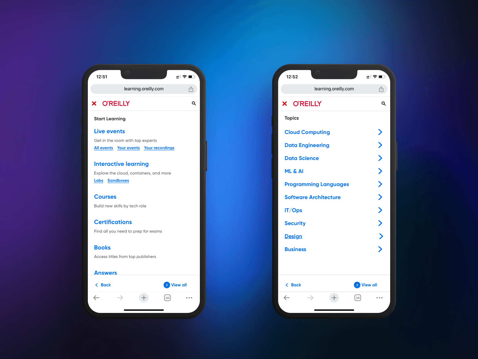
  • new o'reilly navigation mobile-web views

    Mobile ready

    Desktop layouts were translated to mobile-friendly versions that feature bottom-positioned Back and More links to reduce thumb travel.

profile image of designer james touhey

A popular study by Smashing Magazine shows that sticky navs are 22% faster and more favored by users.

We switched to a top navigation bar to reduce cognitive overload from the cluttered left column and inconsistent collapsing sidebar. Consolidating to a single top nav created a cleaner look with fewer starting paths and more targeted entry points.

Projected Outcomes

Though I wasn't at O'Reilly during or after the release of these features, I projected the following outcomes as part of the strategic planning effort for this launch.
Increased Usage

Efforts aimed for a streamlined navigation, reducing user content search time and increasing consumption. The shift targeted a potential revenue boost of $2.6 million and anticipated improved Customer Satisfaction (CSAT) and Net Promoter Scores (NPS) by Q4 2022.

Reduced Marketing Spend

Benefits included lowered Marketing costs for each new release, with reduced in-app marketing for discovery. This allowed resource allocation for higher-value opportunities and a decrease in Support tickets related to content organization, enhancing user satisfaction.

Improved Sales Enablement

Enhanced information architecture improved Sales enablement by providing better exposure to high-value content. This reduced dependencies on "cheat sheets" and "sitemaps" as Sales Aids, encouraging more intuitive customer demos and building trust.

©James Touhey, 2024, All Rights Reserved

©James Touhey, 2024, All Rights Reserved

©James Touhey, 2024, All Rights Reserved